Linear Magnet | Logo design
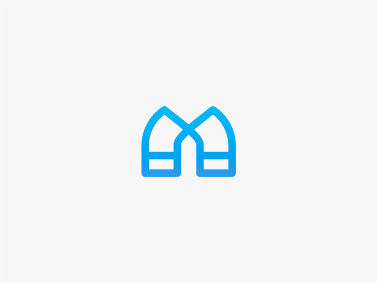
Logo concept for a mock app called Linear Magent - This is my Third brief produced by goodbrief.io - Brief: Create a Logo for an app called 'Linear Magnet'. The client wanted a clean design that was subtle and incorporating the colour blue. The audience for the app is adults that want to keep track of their contacts - Process: As with most of my Logo concepts, I like to try and add 3 elements into the design. I started with the shape of a typical magnet, and expanded on this by including the letter 'M' also utilising white space to create an "arrow" to symbolise 'Lineaer' - Time: 2 days - Please let me know your thoughts on this logo, open to all feedback.