How I start making a monogram
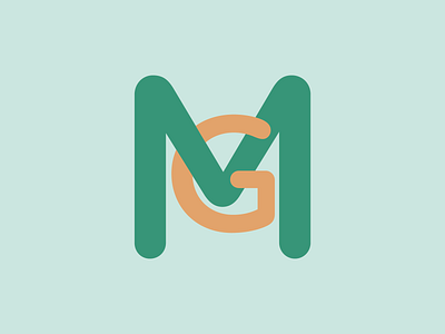
To work out how to make two letters work together I tend to use a simple Sans Serif font, this helps easily figure the shapes and the balance between the two letter marks.
This is the beginnings of a current live project, I never sent this to the client this was purely a sketch. If they were after a "modern" mark I would have had the G the same weight as the M to make them balance and remove the emphasis on the M. Again purely exploratory!
More by Rupert Harvey View profile
Like

