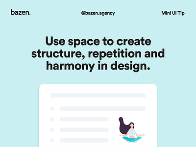
Mini UI Tip - How to use space
One of the most common design mistakes is misuse of space. _ Not only is good spacing important, but it contributes to the overall structure, harmony and balance of the design. _ You should always first think carefully about which spacing is the most adequate and then use that template throughout the design. The structure is best achieved by using the same spacing throughout the project, and by carefully planning the layout of the objects.
Get more tips about spacing here: https://dribbble.com/shots/10786778-UI-Tip-Spacing
More by bazen.talks View profile
Like
