ProCreate Icon Redesign
An app icon without a logo?
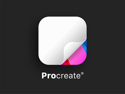
When we're faced with a sea of brightly coloured apps and big logos all fighting for our attention, the only way to stand out is to do the exact opposite. A white square, no logo, just a hint of colour.
No single logo can truly speak for the multitude of creative voices that use Procreate. Instead of a new logo, the icon is based on the humble piece of paper – the blank canvas that Procreate provides us all with. Colours from the old logo are retained, showing a hint of what's possible beneath the page curl.
#GetCreativeWithProcreate
More by Callum Dawes View profile
Like

