Procreate App Refresh | Official Playoff
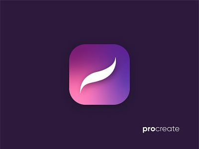


I based my design off the idea of a gorgeous app for "gorgeous illustrations." Flipping the gradient to the background still highlights the white icon that represents the user's mark, whether that be an illustration, animation, sketch. I wanted the feel of this refresh to look sophisticated and beautiful. I changed the font in the word mark and made the P lowercase so that it feels more friendly and conversational. #getcreativewithprocreate