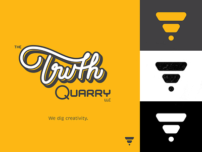
The Truth Quarry basic Brand Assets
Check out some of our basic Brand Assests for The Truth Quarry.
Wordmark - "Truth"
We created this hand-lettered wordmark to represent the hand-drawn roots that we come from. We wanted to showcase custom, hand-drawn, creative, smooth and depth with this mark. All of these adjectives help convey what we are all about at The Truth Quarry, from our style, approach, process, knowledge, optimism and client experience.
This started out as brush pen lettering exercise. Originally a sharp, choppy and rigid script, we captured the ligature between the "T's" (we know its a stretch but it looked too cool to pass up). We wanted to refine it and give it more of a "rolling" feel as you read along.
Let us know in the comments if you have any interest in seeing the original wordmark!
Icon - "The Dig"
This is representative of our creative process. "L.E.A.R.N.". Through this process we dig down, find those "truths" that help build creative ways for our clients to differentiate from their marketplace competition. It's about progress, transformation and results.
Interested in working together ?
Have questions?
Problems to solve?
Ideas to explore?
Drop a DM -or- 📨 create@thetruthquarry.com
www.thetruthquarry.com
