Gift for Starbucks 3.0
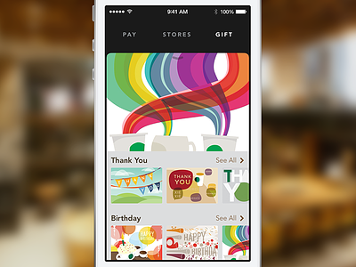
One of the things we wanted to do in our redesign was improve the gift-sending experience. It's a wonderful feature, but didn't quite showcase all of the available art that we had available.
We focused on bringing the card art forward, making it less like a form, and more like a card store. This design is heavily inspired by the App Store, with a carousel up top and categories scrolling off to the bottom.
Big thanks to @Jesse Herlitz and @Jeff Peters for all of the feedback and inspiration!
More by Bryan Clark View profile
Like
