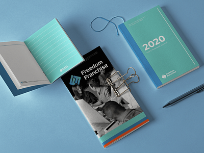
Stationary design for Freedom Franchise
The logo is a play from the initials of the company’s name: Freedom Franchise. The main goal was to enforce a visual brand identity while having a multi-production use for both web and print. The gradient Seafoam colors, the typeface (Magistral) and the structure the logo convey that the company works in the digital field. The simplicity of the icon can be easily reproduced in plain print or in the smallest web usage- a favicon.
More by Utsah Pandey View profile
Like
