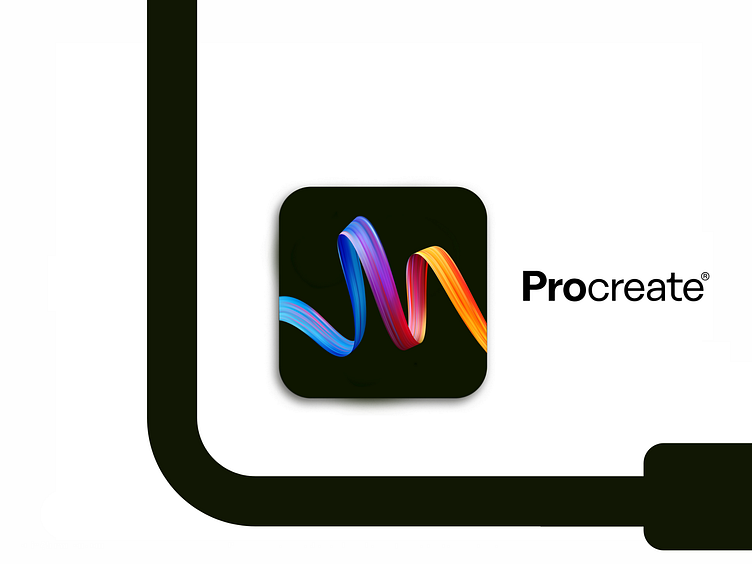
Procreate app icon redesign
I thought that the icon needs cleaning. :) The current one kind of wasn't really compatible with the logo. I used the brand colors. Black and reflective colors to be easily noticeable on the screen. Lines represent that the process of a design is a curve, not a straight line. Process the creation! Procreate.
More by Martin Milenkovski View profile
Like

