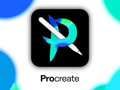
Procreate Icon Redesign
I went with a brush style letter "P" and added a stylus piercing the center. Overall I'm really happy with how this turned out and I think the blue/green scheme is a good look on Procreate. :)
#GetCreativeWithProcreate
More by Carter M. View profile
Like

