Procreate Redesign
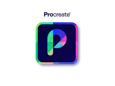
To me Procreate is where analogue and digital creativity meet so it was important for me to communicate this in the design.
The tip of a pencil represents the analogue and the "P" (for procreate) shape represents the accuracy and smoothness of digital.
It was important for it to also be playful which is why I included hints of a colour wheel as well as for it to be bold so that it would stand out.
In the end I am very happy with the results!