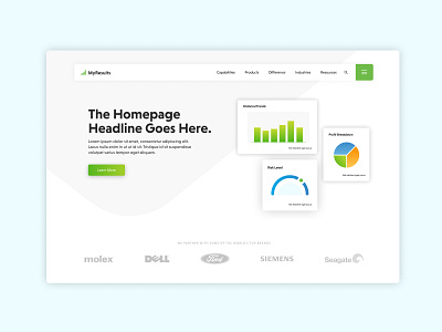
Homepage Exploration - WIP
This was a rejected concept for a client's homepage but it felt too good not to share!
The client occupies an area of business that traditionally relies on a lot of stock photography and corporate colors in designed materials. We took a risk and did some exploration of what leveraging color & graphics could look like to help them stand out among their competitors.
This idea was ultimately scrapped, but there are elements of it that we will be leveraging in the final design. Overall, a super fun design exploration and challenge!
** Client name changed for privacy
More by Liz Bryson View profile
Like
