Nike Website Redesign
Hi Dribbblers!
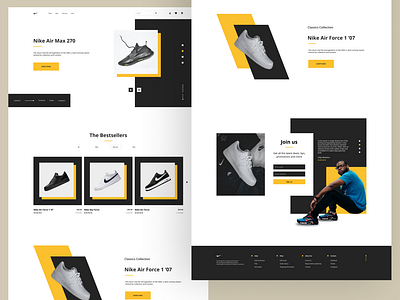
This is my approach to Nike website design. To me, real website looks little bit boring. With this design I tried to make it look better while keeping it look still usable. Did I manage it or not? it's up to you to assess :)
Your thoughts and feedback are always welcome :)
More by Ioseb Chitishvili View profile
Like
