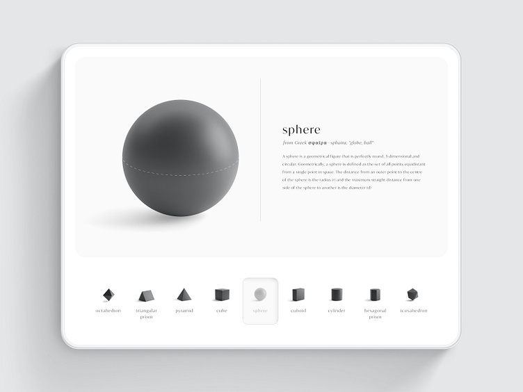
Minimalistic Touch Navigation - Balance & Shape
Hello there! 👋
Minimalism is about balance - information provided to information withheld, positive space to negative space, and aesthetic to function.
It's a pretty display sure, but is the typography readable with such low contrast and scale? Is the information useful to the reader? Is the real estate utilized effectively? Yes there's shape, but is there balance?
Please ❤️ if you appreciate this work.
Are you looking to build a web or mobile application? I'm glad to collaborate with great companies on interesting projects. Hit me up for coffee or to chat about your next project at hello@mitchmills.com
Want to see more in the future? Subscribe here 👇🏻 Medium | Instagram | LinkedIn