Typographic Components
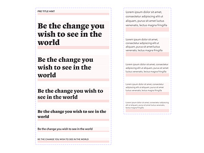
Some components I'm working on for specific typographic needs in Figma. Each component mirrors the type style in the system, but includes a "spacer" for consistent margin below that particular text block.
When used correctly with other components and auto-layout, spacing works magically when everything is together. Grids are turned on in this view with a single row grid to match the spacer in the component and another grid with a 4px baseline.
More by Tyler Sharpe View profile
Like
