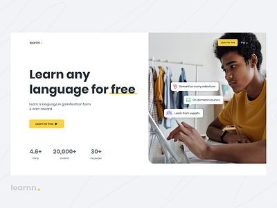
Hero section of language learning website
Learnn is a platform to learn any language for free in gamification form.
It is not just any other language learning platform, it keeps users engaged by making learning fun and motivates them with rewards on every milestone.
This is the "Hero Section" of the website soon I will be sharing more updates.
What you can take away from this?
1. Navigation is kept very clear with no distraction with only CTA & change language of website (which in this case is important). This makes your page more focused as users have limited options here and it doesn't distract your user.
2. Hero section is a very important section of any landing page because it's the first impression of any website, it can make or break your company website.
3. Here I have used a large image that depicts the learning scenario, instead of illustrations I used an image here because in an online learning platform where everything is virtual it's very important to relate to a user/learner and images are the best way.
4. The Main heading is very clear and large "Learn any language for free" with underlined free, this explains to users about the website that it's an online language learning website.
5. There is a very clear CTA with the copy "Learn for free" which compels the user to click on the button.
6. At the bottom you can see some numbers these are social proof which plays a very important role as people first look for reviews or if any others we use the product or not and this stats on hero section itself tells everything about the website.
Stay tuned...
Want a website like this:
abhis.jain1508@gmail.com
