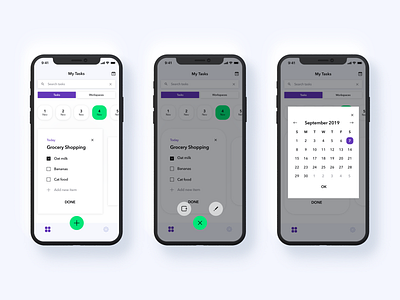
List Taking App
CONTEXT
'List' is a personal short project and part of CareerFoundry’s UI Designer Course.
OBJECTIVE
I got an urgent design request to deliver a note-taking app with a popular design motto, “less, but better", in mind focusing on one or a few related tasks and on how to help us accomplish them easily.
APPROACH
I aimed to build a clean interface with minimal requirements including only what is functional.
CHALLENGES
Overloaded by multiple features, options and choices I got inspired by Functionalism, a principle stating that form should follow function.
THE OUTCOME
Regardless of this minimalistic approach, I didn’t want to ditch beautifully styled elements.
Find this and more projects on my website. ☺️
More by Minna Virkki View profile
Like
