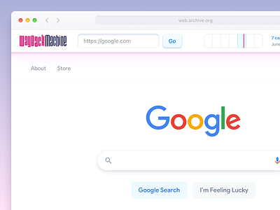
Wayback Machine & Google Search Redesign
The Internet Archive Wayback Machine looks like it hasn't been updated since 2005. Which wouldn't be a bad thing, if it had been designed at the height of that era's design competency. Also, it has this really annoying tendency to overlap the header of websites, which needs removing.
So, I figured I'd take a crack at it, for the post-mobile, post-large-monitor web.
Needing a simple reference page to be "archiving," I chose to also redesign the Google homepage, which is always shamefully out of sync with contemporary design standards. Here's how that could look.
More by Eli Schiff View profile
Like
