Music Streaming App (Dark Theme)
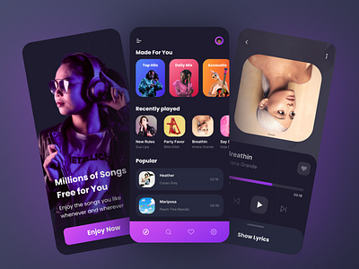
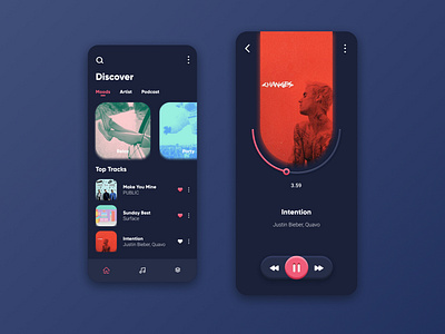
Hello guys, it's me again, today I want to share the results of my exploration about music streaming applications. In this exploration, I used a dark theme, because I think this is a trend that exists now, especially for music streaming applications. I made it in 3 screens: 1. The splash screen contains an image explaining that this is a music streaming application, then there is a short explanation and a button to start enjoying music, the purpose of this screen is to provide user information, 2. Explore screen is the main page it contains various categories which later aims to make it faster and easier for users to find or select the song they want without the need to search for it through a search form, 3. Now playing screen contains information on the song being played by the user such as cover, title, singer, duration, lyrics, and there are multimedia keys such as play/pause and move forward / move backward. And that's it, so what do you think?
Hit the"❤" button if you like it, thank you 😉 , and have a nice day 🌈

