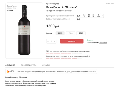
Wine store — product card
This is a sample how a product page for wine shop can alook like. It containes a lot of information and social mechanics to improve user experience and retention metricks.
Need to check it on UX-tests besides, but not so bad for the first iteration :)
More by Givental View profile
Like
