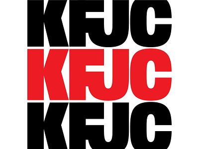
KFJC KFJC KFJC
KFJC is a college radio station that's been blazing trails for over 60 years. This logo idea was a challenge from a colleague to make a custom FJ ligature. I have always been really unhappy with the way the call letters looked together. There's an obvious chasm between the F and J. Some ways that have been employed by other designers to work around it were to stack the KF and JC in a square or to use a fat italic or increase the spacing overall but it still just looked fucking awkward to me. This feels like it could be something timeless.
More by Dan Kletter View profile
Like
