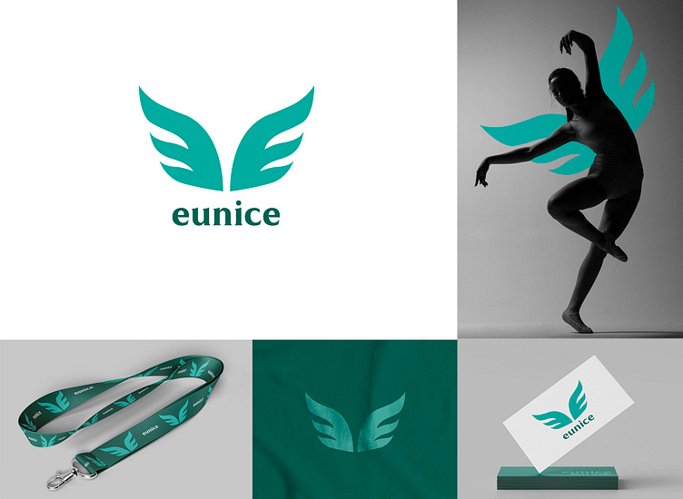
Logo and branding for dance studio
Eunice is a dance studio for people of all ages. The logo is based on two wings, which are strongly associated with this studio. In the main hall, there is very beautiful graffiti on the wall and many people recognise the studio by this piece of art. During the sketching process, I caught up this symbol and draw some interesting options. To give this logo more balance I chose turquoise, which is simultaneously calm and spirited. Cooperation with Eunice brought me new approaches to creating logos and branding and I appreciate this unique experience.
More by Anastasiia Lisovenko View profile
Like
