Tickets Aggregator App
The team is available for new projects! Drop us a line: hello@purrweb.com | WhatsApp | Website
Yo, friends! Check out how the Purrweb team designed a Tickets aggregator app! 🎟
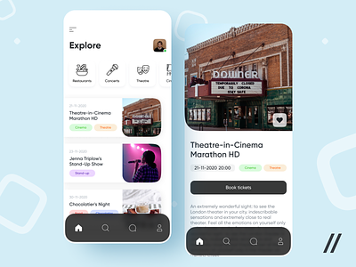
🎫 On the left screen there are categories where you can filter events by categories: concerts, restaurants, theater, and movies. Below are cards with the nearest events by date. The card contains the date, name of the event, and its category.
🎬 The second screen — the event page itself. In this case, it's a movie show. There is a name, date and time of the event and category, there may be some of it. You can buy a ticket for the event inside the app. Some brief information about the event has also been added.
🌚 In the app, the accent color is black, because it is neutral. This is done for a convenient way to form color categories and not to connect them to the accent color of the entire app.
All the main events in the city are collected in this app and you can quickly decide what to do on the weekend 🥳
Press L if you like our design and share feedback!
Created by Polina Tolmacheva
PS We know to utilize UI/UX design to make users fall in love with a product. Check out how we used our skills to:
- raise $400k as capital for startup
- streamline cryptocurrency e-wallet
- reboot a Real Estate startup
- help newbies jump into investing
- conquer the chef freelance market
- simplify the life of event organizers
And that's not all — you can find more case studies in our Blog! 💜


