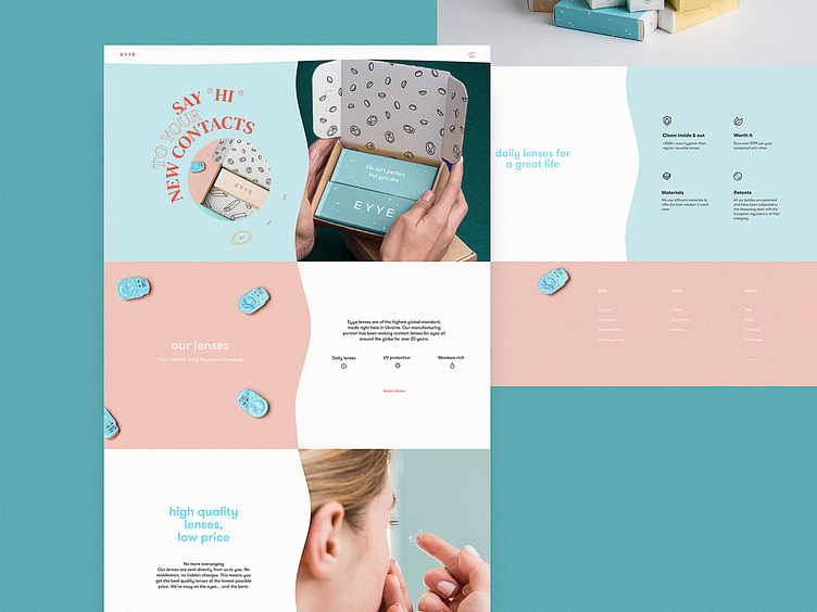
Contact Lenses Website Home Page
Check new design giving you the first glance at the website selling and promoting contact lenses. The hero section of the home page features the split screen with informative photo content. The eye-pleasing color palette, elegant typography employing the unusual text directions, and the scannable layout of all the page attract users' attention and let them quickly skim the content. Stay tuned to see more on the project!
Also, welcome to read more about types of images in web interfaces, learn how to design search interactions and how to reach design consistency, and review the guide into basic types of web pages.
More by tubik View profile
Services by tubik
Like

