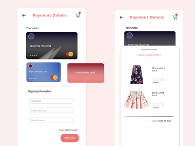
Daily UI 3 - Credit Cards
So this was a lot harder than expected, I couldn’t really think of what a standard check-out page looked like, and all the inspiration I found online seemed quite different.
I had an idea of having the credit card carousel and really wanted to do something with that.
I also didn’t end up using my original colour theme - which in hindsight I should stick to my chosen colour schemes as those colours look less jarring since I go through a colour picker. Feedback / improvements welcome please!
