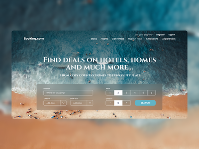
Landing Page | Booking
Hi, Dribbblers! 💙
I redesigned the landing page for Booking.com.
What do you think about this color palette?
I invite you to check out more about this project on Behance https://www.behance.net/gallery/108394585/Landing-Page-Booking
I would be grateful for your feedback! 💙

More by Solohub Anna View profile
Like
