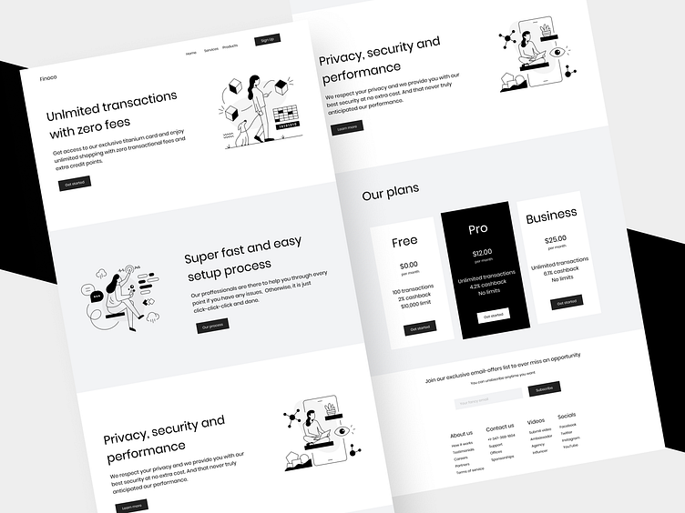
Finoco: Fintech Website
Hi there,
Today I'm back with another Financial Service Website. I chose a monochromatic approach to design this, I know it's not the interesting type but if you pay close attention you'll get that monochrome is yet one of the best possible way to put out a minimal website that talks to the point and no trash.
This is also a practice shot and is a lot pragmatic as that's what I focus on the most. I took care of accessibility and usability as well. Even though it is monochromatic, some designers use very light whites that makes it hard to read. Contrast is very important, don't forget that 108 million of our friends are color-blind. We gotta consider and take care of them.
Hope you guys like it 👍
If you want to work with me then click that "Hire Me" button duh! 🥳 or if you're looking to connect with me I'm on Twitter 🍕
