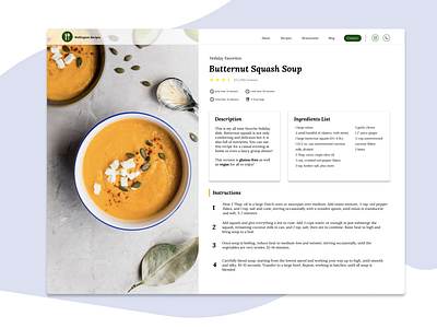
Recipe Landing Page
This is my design for the weekly warm-up in which the task was to create a design dedicated to one of my favorite comfort foods. I chose this particular design because I believe that, when creating a recipe landing page, you need an image that gets your stomach rumbling. I used one font and only a few accent colors because with a recipe landing page there shouldn't be distracting features because the people reading it are probably hungry and want to get cooking!
More by Katy Wellington View profile
Like
