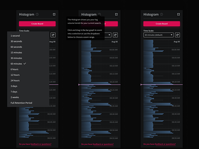
Behold! An Early Histogram Mockup!
I have been working through some data visualization tools these last couple of weeks. The main focus has been this timeline panel that lives on the right-hand side of the project.
We call this component the "Histogram" internally. It is responsible for visualizing log line counts for a specific date range: whether it is in 10ms or 30day increments, the Histogram now lets you look at your logline data trends, make selections (more interaction designs and gifs on the way), and scope in on spikes (or absences) to pinpoint the problems and more importantly monitor for anomalies and detect issues before the sadness even begins!
There are many details to unpack here soon, but I am pretty happy with this direction and what LogDNA customers will do with this new toolset!
