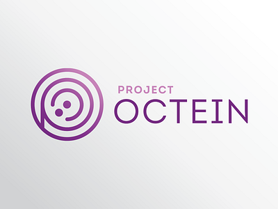
Project Octein logo
Part of my full-time job also includes helping faculty at the college with projects - some of this work has delved into the marketing sphere, in order to help offload some of the marketing team's work. I've been working closely with the Information Technology department at MCC on marketing initiatives, and one project they had was to create a logo for Project OCTEIN. Project OCTEIN is a faculty-led initiative aiming to bring diversity and inclusion to the local tech industry by making information technology accessible to those who may not normally have access to the industry, with an emphasis on students of color and female students. MCC faculty collaborate with local groups and initiatives on events, courses, and more, building layers of the community into this initiative.
The final logo is meant to be simple but sleek - it blends in well with modern tech branding, while also retaining elements of MCC branding, such as the Intro font for the wordmark. The mark itself not only has the "P" and "O" hidden in the circles to stand for "Project Octein", but the circles building into each other represent the layers of communtiy involved in the initiative, bringing in underrepresented communities (shown by the two dots, AKA the targeted groups of female students and students of color) into the tech industry. While Information Technology at MCC uses purple for their branding, there is no specific purple deemed by marketing for the department, so I went with a directional gradient, to represent growth and upward movement in the community.
