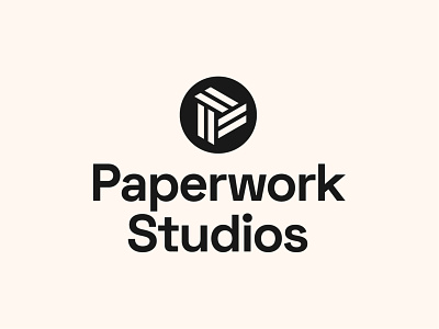
Paperwork Studios - Badge Logo Design

More logo lockup explorations for new startup, Paperwork Studios.
Balancing the abstract logo inside basic geometric shapes is an optical challenge! Whilst the logo looks rotationally perfect it actually leans heavily on the right.
This means every time it's placed in a shape it has to be optically balanced. It's very easy to overcome but definitely made me smile when I first noticed it.
Symmetry hidden in abstract shapes.
Interested in working together? Email: hello@connorfowler.com