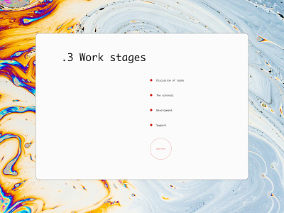
QuiteByte IT company work stages
Hi friends,
Glad to share with you another piece from the QuiteByte which is already fully accepted by the client. Today, it is a work stages page.
This is a simple page that grabs attention precisely on the points. The accent color, modern red, is used to highlight list items
Stay tuned to see other pages😉
Follow my Behance https://www.behance.net/sia_lanceva
Instagram https://www.instagram.com/sia_lanceva/
More by Anastasia Lanceva View profile
Like
