chess.com

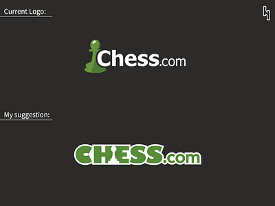
Here i redesigned chess.com logo. I put the pawn in the negative space of the word CHESS that makes the logo more balanced.
Let me know what do you think.
Press L for Like!
Here i redesigned chess.com logo. I put the pawn in the negative space of the word CHESS that makes the logo more balanced.
Let me know what do you think.
Press L for Like!