The Road Not Taken
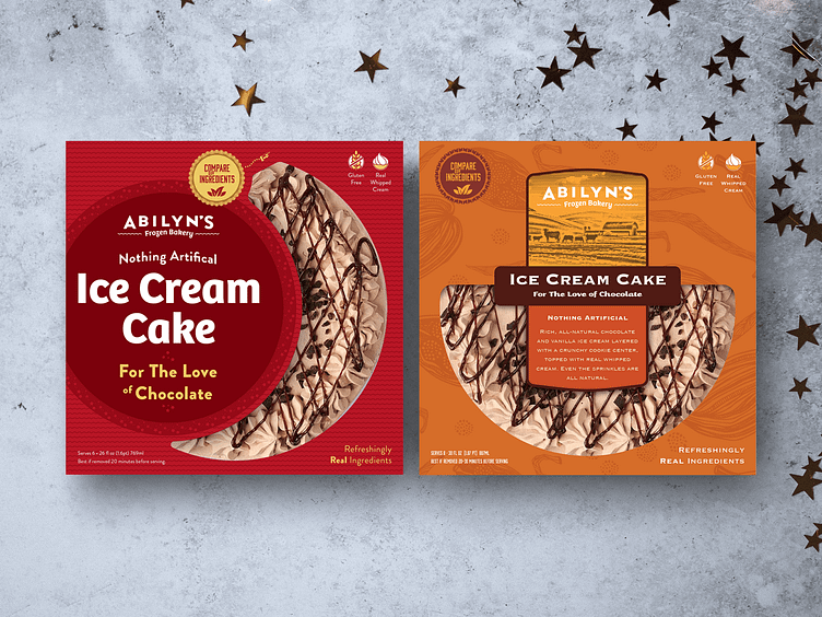
An example of the road not taken. The design brief for this project called for a premium brand presentation - and there are many ways to achieve that goal. It's interesting to see how changing the design style can evoke a totally different personality. In this case, the red design (the approved direction) feels playful and celebratory while the brown design feels more decadent and luxurious. Both check the premium box.
More by Jeff Sugarman View profile
Like
