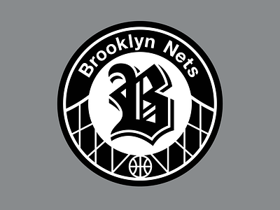
NBA | Brooklyn Nets Logo Redesign
The Brooklyn Nets could really need a new primary mark.
Helvetica, used on Brooklyn's NBA court, and of course at train stations across New York City, an old English letter "B" for Brooklyn, plus a simplified version of Brooklyn Bridge's main cables, unified inside a black-and-white roundel.
Thanks for watching!
More by Alex Clemens View profile
Like
