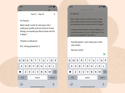
Messaging Window
I‘ve always been dumbstruck as to why the input field in messaging apps is so tiny? It destroys legibility when typing and created a generation of users where it nudges them to send short bursts of information, down to one-two words, sometimes just an emoticon.
I believe it‘s worth reinventing the chat a bit, where for each time a user types in a message, the UI provides a generous space for him to write longer and more meaningful sentences, while at the same time fading the noice from the previous messages, so that the UX provides a sense of calmness.
What is Tribevibe?
Tribevibe is a global community of travellers, wanderers, and curious people that thrive under the premise that the world is inherently good. It provides a platform for meaningful connections and experiences. Simply put, it's a community for untourists—for those that travelling is a way of life and a path to self-discovery.
___
Find us at:
Our website · Instagram · Facebook

