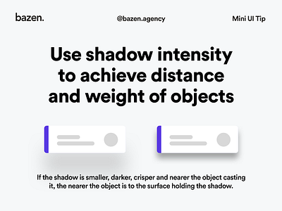
Mini UI Tip - Shadow intensity
Here is an interesting and quick tip on how to give your designs some depth! 🤩 _ Shadows are often used in UI design, however not many designers know how to use them properly. _ Objects that are heavier tend to have darker, crispier and thicker shadows.
Get more tips about shadows in UI here: https://dribbble.com/shots/14206365-Mini-UI-Tip-How-to-use-shadows-to-achieve-depth
More by bazen.talks View profile
Like
