Metro | Supermarket Rebranding
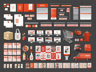
The objective of this supermarket rebranding is to unify the graphic image, as well as modernising the brand. That's why an intense orange has been chosen as the only corporative color to communicate strength, energy and to provide coherence to the brand. Graphic resources such as vertical lines and repetition are used to provide dynamism and to impact the public.
To see the complete project:
https://www.behance.net/gallery/90055747/Metro-Supermercados