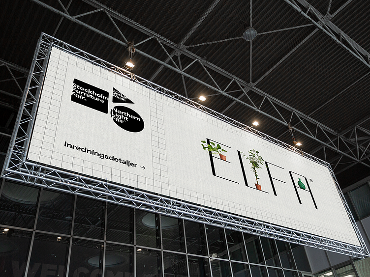
Elfa | Brand identity
The concept was to have flexible logo. So the wordmark, could be tailored (stretched vertically or horizontally) and therefore - by mimicking the various shapes of their products - be used as a key visual element.
Grid is also introduced as the key element of visual identity, helping to maintain the idea of space, balance and order.
More by Andrius Vaskevicius View profile
Like
