logo 3
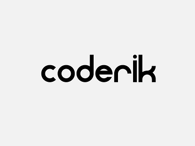
I'm still playing around with my new logo. I just want it to be clean. Because I will combine software engineering and data science, I thought of geometric shapes, so circles and bars (like a lot of visualisations in an EDA). I am quite satisfied with the "coder" part, but still not totally happy with the "ik" part. Any thoughts?
More by Erik Van de Ven View profile
Like
