Reason Dribbble02
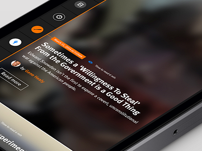
I use my Reason.com app more than any other app on my phone. And to me, the ap provides a less than stellar experience. I've been thinking about redesigning it for a long time and finally got around to it. This is the Articles screen. I imagine that as you scroll, the copy and image parallax move and the next article moves over top of the previous article. I plan on animating this at some point...
The app tells the user how many posts they have yet to read, how long each post takes to read, and it indicates whether the user has already read an article. I think it'd be cool if the app tracked what the user has read and moves those posts to the bottom of the order and shows the user posts that have yet to be read for any 24 hour period.
Thoughts?

