Card UI / UX
Hello World!
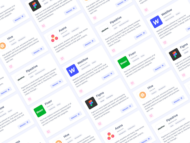
This is a sneak peek of a side project me and my friend are working on. One of the most important areas of the platform is a tool page made out of cards that allows users to discover and try out new software.
The task here was to put as much useful information in the cards while not oversaturating it and maintaining key actions clear and visible.
The tool card contains: • Tool name • Website URL • Chips (show to which category the tool falls in to) • Brief description • Like Button (heart) • CTA (The CTA leads users to the website of that tool, but clicking on the card itself will take you to the individual Tool Page in our platform for a broader overview of the tool itself)
Feedback will be appreciated Thank you for your time 😉
More by Kostas Pac View profile
Like
