Telemedicine App Design
Hello, friends! Really wanna share with you this design for a Telemed app!
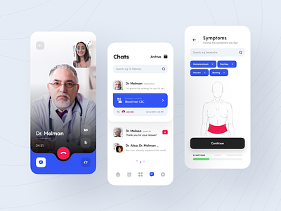
In a nutshell: you find a doctor for a session and make an appointment with them in a free time slot. The doctor can prescribe tests, leave a report about the session, and write a prescription for medications. There is a video call option and there is a chat option.
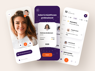
👩🏼💻 On the left screen there is a video call with your doctor. You can see the doctor, turn on/off your camera and open/close the chat.
👨🏻⚕️ You can filter your doctor's choice by appointment cost, rating, or work experience. In the middle screen — selecting a doctor after filling in the filters. You can swipe doctor cards to the right and left + select the doctor you like.
📆 The right screen: a calendar. You can view upcoming and past sessions and your medication intake, and also view notifications that you receive.
🍆 The color solution was to pull up the colors from the existing branding. I didn't want to use the classic medical blue and green colors, to avoid being banal. I decided to go for style and took a combination of dark eggplant and bright orange. Orange is like a primari color because it is bright + it is well-visible on any background.

