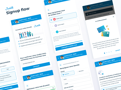
Signup flow ✨
Our design team worked really hard this summer on revamping the signup flow in the booking funnel.
On Doctolib, most users create an account when booking an appointment. In order to improve our conversion rate, we ran user research sessions in Germany to understand our users' actual booking habits. We focused on the signup steps that come after the choice of a practitioner, a visit motive, and a time slot.
Key learnings :
1. Inform patients: Whether it concerns their data, or what Doctolib does, patients are more likely to finish the flow if they fully understand the advantages that they will get by registering, and who they are giving their information to/ what is being done with it. Especially in Germany where data privacy is taken very seriously, and Doctolib is less famous than in France (a lot of practitioners have their own personal website and use Doctolib only for the booking system)
2. Shorten the journey: Patients were frustrated by the length of the registration journey. This frustration may not come from the amount of information asked, which most deemed logical, but the point in time at which it is asked.
3. Reassure patients about their appointment being "pre-booked" during the registration, as they were afraid of losing the time slot.
4. Improve overall UX writing and wording consistency across the flow.
After a lot of ideation and user testing sessions, we are proud to show you our new signup flow that should be live later this month! 💯
-------------------------------------------------------------------------------
💼 HIRING: Design Ops - Product Designer - User Researcher Manager
Join our team of 25 multidisciplinary designers in Paris 🇫🇷 and Berlin 🇩🇪


