The Eternal City law firm design
Hi friends!
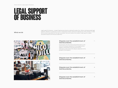
Today I'm posting another page from the eternal city project. The main purpose of the design is to convey the reliability of the company, the use of hackneyed stereotypes inherent in most sites in this area.
The newspaper style was adopted as a basis. Its elements can be traced from headings, which are written in typical condensed font, to page layout. The old-style design is combined with modern elements to give the site an atmospheric yet restrained look.
Project on behance ->
https://www.behance.net/gallery/106835515/Eternal-City-law-firm-Website
Don't forget to stay tuned😉
Follow my Behance https://www.behance.net/sia_lanceva
Instagram https://www.instagram.com/sia_lanceva/
More by Anastasia Lanceva View profile
Like
