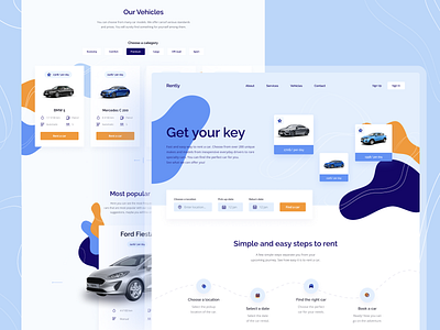
Car rental website
Hello Everyone! 🙌🏼
We’re presenting a completely new project. Check out all the features and more about the design of Rently. 💻
What is Rently? 🚗
Rently is a website for renting cars in different classes. You can choose vehicles in several categories:
- Economic
- Comfort
- Premium
- Cargo
- Off-road
- Sport
Bright, clear, and simple ✏️
The main feature of Rently is that it is a simple, fast system. The heart of the website is a browser with just 4 steps to rent a car:
1. Choose a location 🗺
2. Select a date 📅
3. Find the right car 🏎
4. Book it ✅
Rently highlights:
- Possibility to rent a car from many locations
- 24/7 support
- Competitive pricing on the rental market
- No mileage limit
- Free resignation
- A wide range of car models
About the Rently design:
- Shades of blue mean trust, peace, order and harmony in the project. The addition of yellow in a mustard shade is like a sign for the user: the color distinguishes the essential elements to help the user find the most important functions 🎨
- Real photos of the cars allow the service to build credibility and allow users to choose the right model right away 📷
- Minimalism wins in this project: whiteness space highlights the clearness of the system. It is uncluttered and uncomplicated 🙏🏻
- The pattern makes it original. Abstract shapes are a distinguishing feature of the background and develop graphic communication 🔵
- Testimonials from real users. Customer feedback is very important, so we added it to the site. Opinions build brand awareness and create a strong brand and partnership with customers 🤝
What do you think about the new design? Follow us and feel free to comment. We’d love to know what you think. 💙


