Landing Hero Section | Mapbox
Hey! I'd like to share with you a redesign of the website hero section for map service "Mapbox". They have a few mistakes, such as:
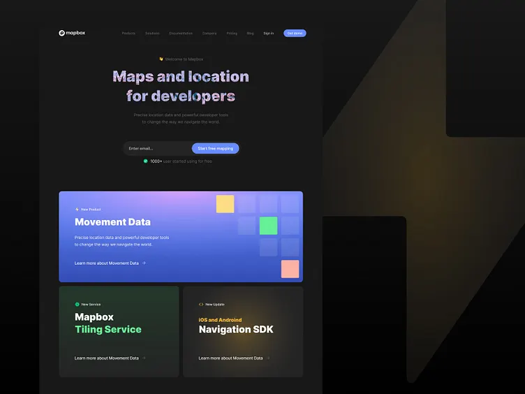
1. When you looking first, you'll see cards with different products and services, that will not give you an image of the whole website. So I put the title first to understand users where they are. 2. Cards, that are first on the website, will bring users to different pages, and it will crush a conversion of "free trial". So, again, put the card below the title is a much more good idea. 3. Personalisation and conversion. I've added a few interesting things, like "Welcome" and "1000+ users start for free". First will give personalization and good emotion for a user, second will provide a strong feeling, that you can trust to a website and start for free too. 4. Cards moved in one line and the same UI, so there was no priority, and hard to focus on content. So I'll need to decide what to put as the main content that the user should focus on, second and third.
Thanks for reading and watching!
