hugo | Icon Metaphor
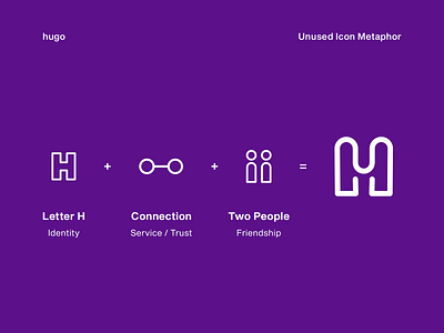
This was the preliminary icon design for hugo that didn't make it to the end. This concept was the most suitable for the brand because its components represented hugo's new philosophy about being the app that were there always for you.
It got later shelved because in the design team we realized that people already recognized the brand's previous logotype and that it was still functional for the brand. It was a short word. It was clear. And the type design was stunning. So, then we just modified the wordmark and started created hugo's new visual language based on a liquid branding concept.
—
