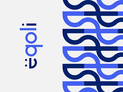
Eqoli Unchosen Concept
A recent unchosen logo system concept for Eqoli, an app (coming soon!) that connects individuals with home health needs and professionals.
For this concept the focus was a look that was welcoming and friendly to showcase happiness and a high quality of life (the “QOL” emphasized in the design). We wanted a direction that was able to be viewed and recognized on a small scale, and unique enough to stand out. The logo system included a logotype that emphasizes the “QOL” as well as a mark that is a combination of an “e” and a smiley face. We also created an abstract pattern that utilizes these elements.
In the end this direction wasn’t chosen, but we’re very happy with the final chosen concept and feel that it hits on many of these same attributes as well while fitting more closely with the brand’s primary message. Hoping to share soon!


