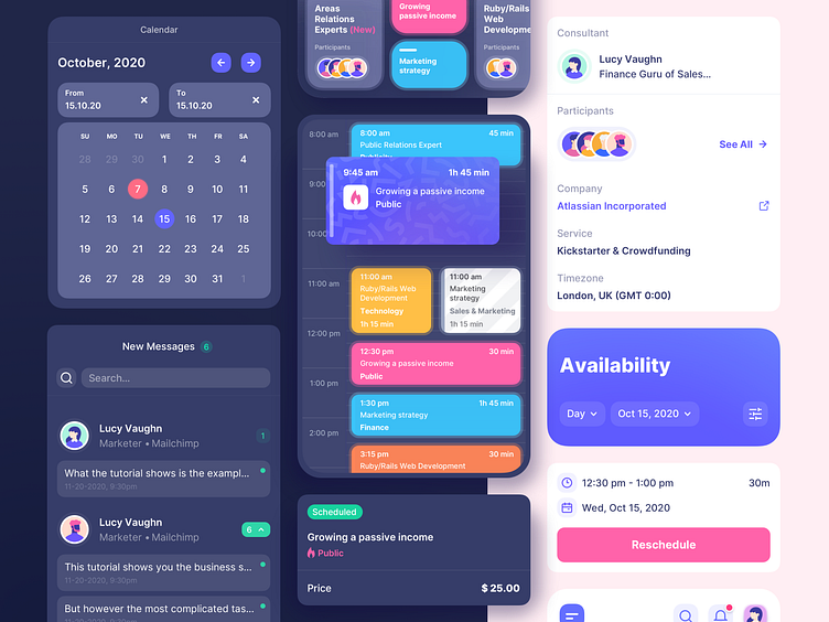
Calendar For Scheduling Consultations Mobile App
Hi guys! What’s new?
You might remember our Calendar for scheduling consultations we presented earlier. Today, we want to share a similar concept for a mobile app.
One of the distinctive characteristics of this concept is its classy dark mode. It not only looks stylish but also reduces strain on eyesight, which improves user experience.
Colored cards, which represent scheduled events, contrast with the dark backgrounds and make it easy for users to scan the whole calendar.
However, devotees of the classical light themes can opt for it, too.
So, what do you say? Black or white? Share your comments below. And don’t forget to press ❤️
More by UGEM View profile
Like

